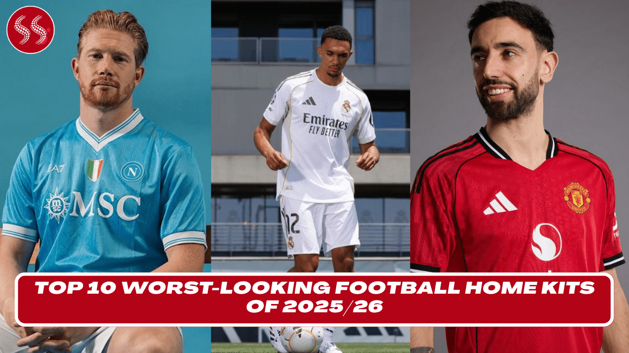
Top 10 Worst-Looking Football Home Kits of 2025/26 takes you on a cringe-worthy journey through this season’s biggest design disasters. From baffling color choices to awkward patterns and outdated templates, these kits prove that even top clubs can miss the mark when it comes to style. In a season packed with sleek and fashionable kits, these 10 home designs stood out—for all the wrong reasons.
This list includes major teams and surprising names, each guilty of delivering kits that left fans puzzled and fashion critics groaning. Whether it’s clashing shades, overly experimental graphics, or designs that simply feel rushed and uninspired, these shirts sparked controversy online and disappointment in stadiums.
If you’re a fan of football fashion—or love a good kit roast—you won’t want to miss this countdown. We break down why each design failed to impress, how fans reacted, and what could’ve been done better. Sometimes bold risks lead to brilliance—but in this case, they led straight to the bottom of the style table.
Prepare yourself for a visual rollercoaster. The Top 10 Worst-Looking Football Home Kits of 2025/26 will leave you shaking your head and asking: “Who approved this?”
10. Burnley FC – Geometric Confusion

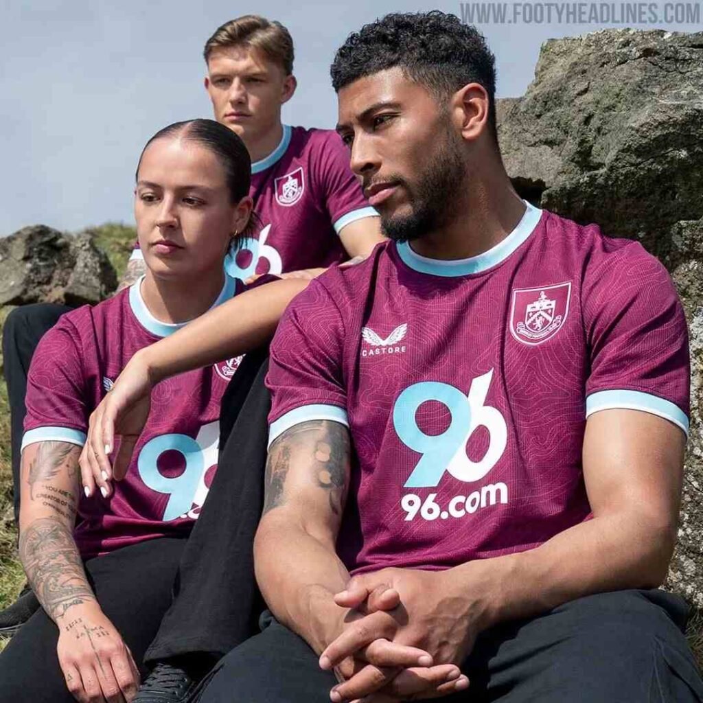
Burnley’s 2025/26 home kit attempted to modernize the club’s classic claret and blue palette but ended up confusing fans and critics alike. The geometric pattern layered over the shirt disrupted the traditional look Burnley is known for, replacing elegance with a busy and disjointed appearance. Instead of complementing the iconic colors, the design clashed, leaving supporters longing for the cleaner kits of previous seasons.
The choice of shapes felt haphazard, and the pattern didn’t translate well in motion, causing a visual distraction during matches. The collar and sleeve trims offered little relief from the overall cluttered look. Fans took to social media to express disappointment, noting that the shirt lacked the heritage and pride that Burnley’s kits typically evoke.
While innovation in kit design is welcome, Burnley’s effort in 2025/26 is a reminder that too much complexity can overshadow identity. The geometric theme felt forced and inconsistent with the club’s roots, making it difficult for players and fans to wear the shirt with pride. For a club with such a rich history, this kit simply missed the mark on style and coherence.
9. Bayer Leverkusen – Paint Splatters Gone Wrong
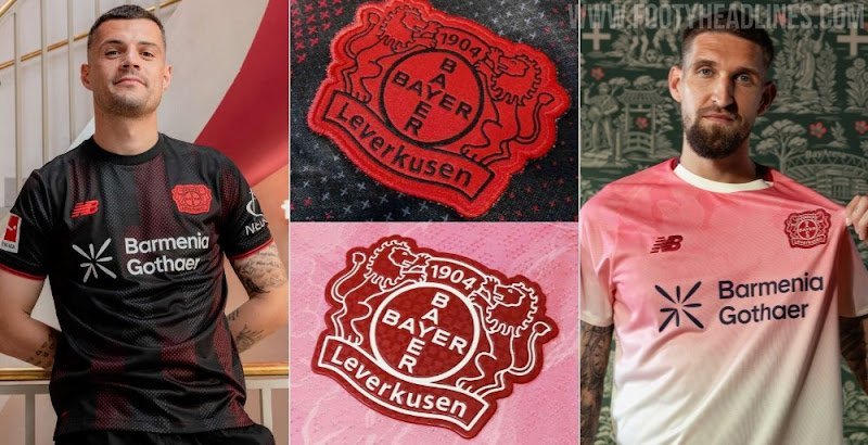
Bayer Leverkusen’s 2025/26 home shirt aimed to be bold with a saturated red base and black streaks meant to evoke energy and aggression. However, the result resembled paint splatters scattered unevenly across the fabric rather than a cohesive design. This gave the shirt a chaotic feel that did not sit well with many fans.
The collar design, featuring a shiny fabric and awkward shape, clashed with the aggressive streaks and further disrupted the overall aesthetic. The black accents felt misplaced, making the kit appear unbalanced and overly busy. Supporters expressed confusion and frustration, arguing that the shirt lacked harmony and style.
Moreover, the overly bright red was considered harsh on the eyes, losing the more refined shade typical of Leverkusen’s identity. The sponsor’s logo and club badge struggled to stand out amid the chaotic background, weakening brand presence.
In an attempt to innovate and energize the look, Leverkusen instead crafted a home kit that felt rushed and poorly thought out. The “paint splatter” effect missed its mark, placing the shirt firmly in the bottom half of this season’s style rankings.
8. Real Sociedad – Stripes and Gradients Clash
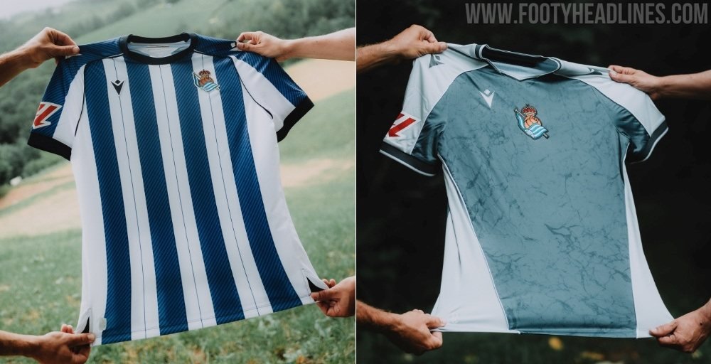
Real Sociedad’s 2025/26 home kit tried to mix classic stripes with modern gradients but ended up with a visually chaotic result. The gradient transitions between shades felt uneven and created a washed-out effect that diluted the club’s iconic blue and white stripes. Instead of the crisp, sharp designs fans are used to, the shirt looked blurry and disjointed.
The combination of patterns failed to harmonize, leaving the kit feeling more like a design experiment gone wrong. The sponsor logo and badge struggled to find their place on the busy background, making the shirt less wearable and less recognizable on the pitch.
Many supporters expressed disappointment over losing the traditional sharpness and clarity that defined past kits. The gradient effect, meant to modernize, instead detracted from the club’s proud heritage. While trying to innovate with color blending and texture, the design ultimately lacked cohesion.
This away from the classic, sharp style left the kit visually unappealing and difficult for fans to embrace. It’s a cautionary tale of how layering modern design techniques without balance can create confusion instead of style.
7. Southampton FC – Unflattering Orange Stripes
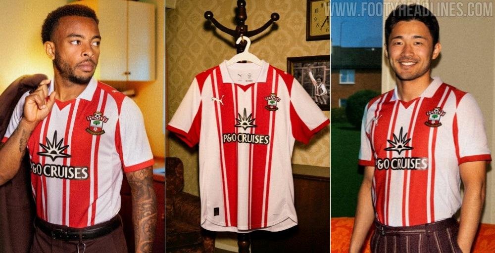
Southampton’s 2025/26 home kit took a bold leap with an orange shade that failed to resonate well with fans and critics. The color choice was described by many as unflattering and harsh, clashing with the club’s traditional red and white identity. Instead of complementing the home colors, the orange appeared out of place, disrupting the overall harmony of the design.
The kit featured thick, uneven stripes which gave the shirt a heavy and bulky look, detracting from the sleekness football kits usually aim for. The blocky design elements felt outdated and didn’t translate well in motion, making the players look cumbersome on the field.
Additionally, the number fonts and sponsor logos were heavily styled and oversized, further cluttering the overall visual balance. Fans were quick to express their disappointment on social media, lamenting the loss of cleaner and more classic designs from past seasons.
While it’s important for teams to try new looks, Southampton’s 2025/26 home kit missed the mark with its aggressive colors and heavy patterning. The shirt felt more like a throwback to poor design choices of the past rather than a fresh take on modern football fashion.
6. Valencia CF – Muddy Beige and Navy Confusion
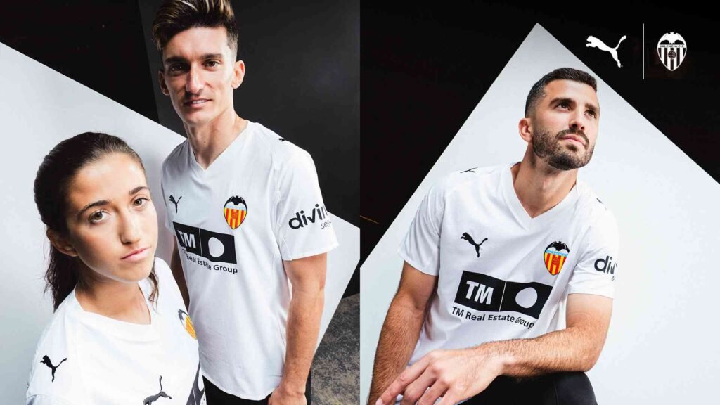
Valencia’s 2025/26 home jersey was widely criticized for its confusing mix of colors and patterns. The base beige tone was described as “muddy” and dull, lacking the vibrancy fans expect from a top-tier La Liga club. Overlaid with navy blue graphics that were intricate but muddled, the shirt lacked clarity and style.
The clashing beige and navy combo failed to blend well, making the design appear visually heavy and unbalanced. The complex pattern distracted from the club badge and sponsor logo, which struggled to find their place amidst the chaotic graphics.
Supporters felt the kit lacked the classic elegance Valencia is known for, calling it uninspired and awkward. Rather than celebrating the club’s identity, the design seemed to obscure it, making it hard to wear proudly.
The fabric’s matte finish didn’t help either, as it made the colors look even more washed out under stadium lighting. Overall, Valencia’s 2025/26 home kit was a disappointment—a rare miss for a club with usually strong, clean kit designs.
Also Read:
- The 10 Most Stylish Away Kits for Football 2025/26
- The 10 Most Stylish Football Home Kits of 2025
- Top 10 Teams with the Most Fouls in a Single Game – 2025
- Top 10 Teams with the Most Red Cards in 2025
5. Napoli – Faded Turquoise Letdown
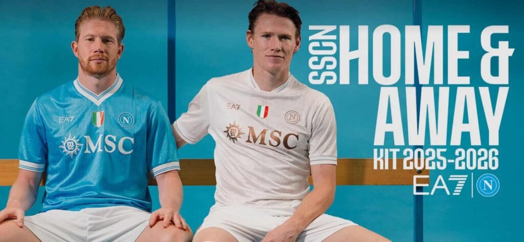
Napoli’s 2025/26 home kit surprised fans, but not in a good way. The pale turquoise base color lacked vibrancy, making the shirt appear faded and uninspired. This washed-out tone did not capture the energy or passion typically associated with Napoli’s on-pitch performances.
The subtle patterns woven into the fabric were too understated and often went unnoticed during matches, resulting in a kit that lacked character and presence. Fans and commentators alike criticized the shirt for blending too much into the background rather than standing out.
The sponsor logo and club crest struggled for visibility against the muted turquoise, and the overall design lacked any bold features that could have saved it from disappointment. For a club known for its passionate fanbase and rich history, this design felt disconnected and dull.
Although minimalist approaches can work well in football kits, Napoli’s 2025/26 effort didn’t strike the right balance between simplicity and style. The result was a forgettable jersey that failed to excite or inspire supporters.
4. AS Roma – Clashing Mustard Yellow
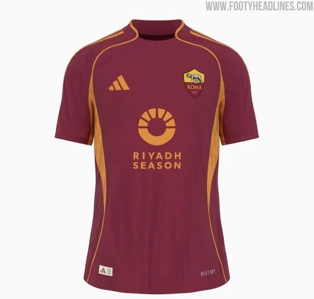
AS Roma’s 2025/26 home kit took a bold but divisive step by incorporating mustard yellow highlights alongside their traditional maroon. Unfortunately, this color combination was widely rejected by fans who felt the tones clashed rather than complemented each other. The mustard yellow accents appeared overly bright and out of place, disrupting the classic elegance Roma’s kits usually maintain.
The design also suffered from poor balance. The yellow was applied unevenly across the shoulders, collar, and sleeves, drawing unwanted attention and creating a jarring visual effect. Fans criticized the overall look as busy and distracting rather than stylish or cohesive.
Moreover, the badge and sponsor logos struggled to stand out against the conflicting color background. The fabric choice and finish did little to soften the harsh color contrast, making the kit less appealing under stadium lights.
Roma’s attempt to innovate with their color palette missed the mark, alienating supporters who preferred the club’s traditional, rich hues. While experimentation in kit design is encouraged, this particular combo lacked the harmony and finesse needed to work. As a result, Roma’s 2025/26 home jersey earned a spot near the bottom of style rankings.
3. West Ham United – Overwhelming Checkerboard
West Ham’s 2025/26 home kit sparked strong reactions for all the wrong reasons. The shirt featured a heavy checkerboard pattern that overwhelmed the traditional claret and blue colors. Fans likened the design to a retro chessboard gone wrong, feeling it stripped away the classic style and sophistication the club is known for.
The large squares created a busy and somewhat distracting effect both on and off the pitch. The pattern dominated the shirt’s overall look, leaving little room for the badge, sponsor, or even player numbers to stand out properly. Many supporters felt the kit was too loud and lacked the subtlety that often defines great football jerseys.
Critics also pointed out that the checkerboard design made the players look less streamlined during matches, affecting the visual flow. The collar and sleeve trims were minimal, but this wasn’t enough to balance the aggressive pattern.
West Ham’s attempt to inject freshness into their kit design unfortunately backfired. The overwhelming checkerboard overshadowed the club’s heritage and didn’t resonate with many fans. It’s a classic example of a design idea that didn’t translate well into reality.
2. Fiorentina – Muddy Purple Gradient
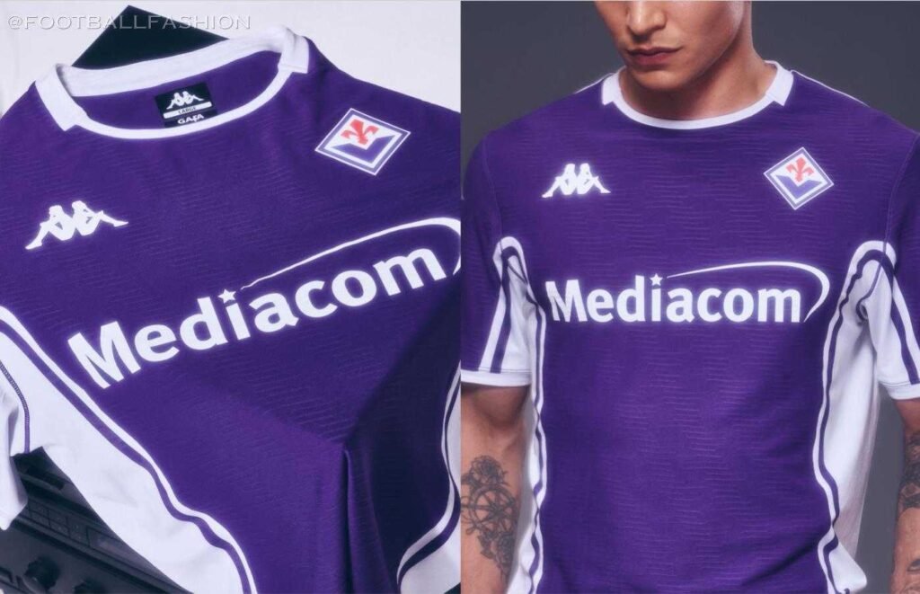
Fiorentina’s 2025/26 home kit attempted to blend various shades of purple into a gradient pattern but ended up with a muddled, muddy effect that disappointed many. The uneven gradient transition made the kit look cheap and visually unclear, lacking the regal feel associated with the club’s iconic purple.
The collar design, featuring a clunky and poorly integrated style, was widely criticized as an afterthought. Combined with the washed-out purple tones, it gave the shirt a rushed and unrefined appearance. Supporters expressed frustration that such a historic club would settle for a design lacking polish.
The sponsor and badge struggled to stand out on the inconsistent background, further reducing the kit’s appeal. Many fans felt the club missed a chance to produce a sleek, powerful home shirt that matched Fiorentina’s proud legacy.
Overall, the 2025/26 kit is remembered as a rare misstep for Fiorentina—a shirt that looked more like a prototype than a finished product. Its muddy purple tones and awkward details place it firmly near the bottom of this season’s style charts.
1. Leeds United – Lime Green Clash
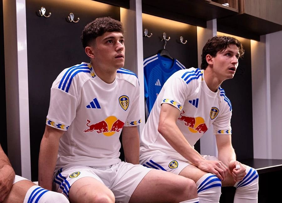
Topping the list as the worst-looking home kit of the 2025/26 season is Leeds United’s controversial jersey featuring lime green accents on a white base. Fans widely criticized the clashing color scheme, calling the lime green harsh, awkward, and completely out of sync with the club’s traditional identity.
The design was further burdened by overly busy sleeves adorned with extra patterning, which distracted from the overall look and made the shirt appear cluttered. The choice of font for player numbers was heavy and oversized, adding to the kit’s visual overload.
Many supporters and critics alike expressed disappointment, describing the shirt as one of the worst in recent memory. The lime green did not sit well against the crisp white background, creating a disjointed and jarring visual effect. The kit lacked the elegance and simplicity Leeds fans have come to expect.
While innovation is essential in football apparel, Leeds’ 2025/26 home jersey is a reminder that some combinations just don’t work. The result was a highly unpopular design, making it the season’s style failure number one.
FAQ’s:
Why do some football clubs release unpopular or poorly designed kits?
Clubs often try to innovate or appeal to trends, but sometimes these designs miss the mark or clash with fan expectations.
Are these kits still available for purchase despite being unpopular?
Yes, most kits remain available through official club stores and retailers even if fans criticize their designs.
Can unpopular kits become popular over time?
Sometimes yes—nostalgia or retro trends can make once-derided kits collectible or fashionable later on.
