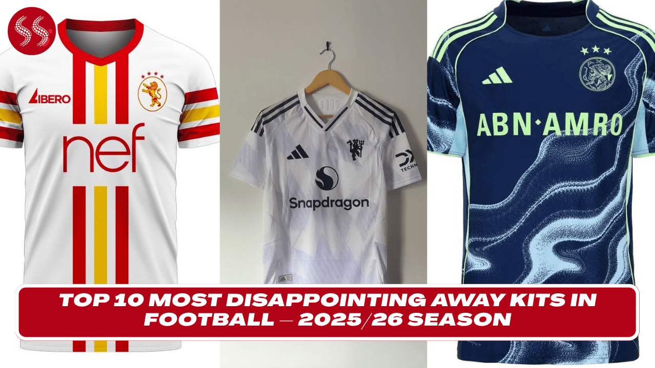
Top 10 Most Disappointing Away Kits in Football – 2025/26 Season explores the fashion flops that left fans and critics bewildered. In a year where many clubs aimed for innovation, some missed the mark entirely. From clashing color palettes and bizarre patterns to design choices that completely ignored club identity, this list dives into the away kits that stirred the most backlash across the football world.
Each kit on this list failed to capture the spirit of the club it represents—whether it was through uninspired layouts, questionable gradients, or over-designed graphics that simply didn’t work on the pitch. Supporters expressed their dismay across social media, with many calling for a return to more traditional styles. Even well-known brands and designers weren’t immune to missteps, proving that style doesn’t always equal success.
Top 10 Most Disappointing Away Kits in Football – 2025/26 Season isn’t just about bad taste—it’s a reflection of how bold ideas, when poorly executed, can backfire. If you’re a football fashion enthusiast or just love a good kit critique, this countdown will take you through the most forgettable and frustrating away kits of the season. Some might even make you wonder: “What were they thinking?”
10. Forest Green Rovers – Luminous Vegan Leopard Print
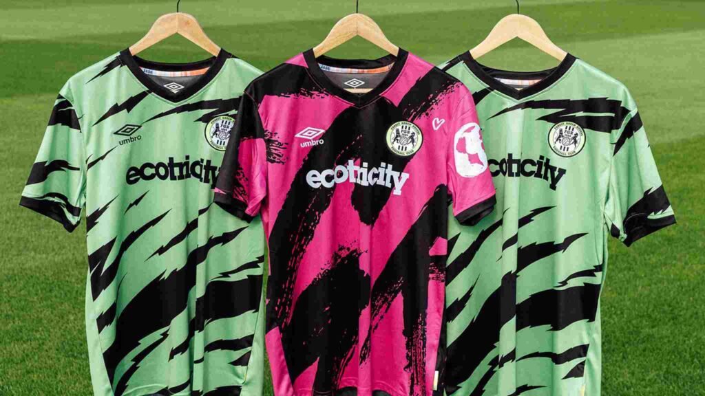
Forest Green Rovers are known for their eco-friendly values, but their 2025/26 away kit caused a stir for all the wrong reasons. This season, the club unveiled what they claimed to be the world’s first fully certified vegan kit. Unfortunately, the design turned heads for its wild lemon-yellow base mixed with bright pink leopard spots. While the club’s intentions were admirable, the result was widely criticized by fans and pundits alike.
Supporters felt the kit resembled something from a novelty costume store rather than a professional football outfit. The aggressive color contrast and cartoonish print made it difficult for players to be taken seriously on the pitch. Even environmentally conscious fans admitted that the design overshadowed the kit’s sustainable message. The overall reception was overwhelmingly negative on social media, with many calling it “one of the worst kits in football history.”
While Forest Green should be applauded for innovation and ethics, this bold attempt at visual flair failed to resonate. Kits can make statements, but this one made people cringe rather than cheer. It’s a classic example of a good cause wrapped in a questionable aesthetic, and it easily earns its place among the most disappointing away kits of the season.
9. Celtic FC – All-Black with Green Pinstripes & Awkward Collar

Celtic FC’s away kit for the 2025/26 season made headlines—but not for good reasons. Departing from their usual green-and-white theme, the kit came in all black with thin green pinstripes and a peculiar button-up collar. It attempted to blend tradition with modern tailoring, but the execution left fans baffled. While black kits often look sleek, this one missed the mark with its clunky detailing and mismatched aesthetics.
Critics quickly pointed out that the awkward collar design looked more like a retro school uniform than elite football apparel. Fans were also disappointed that the club’s heritage seemed sidelined in favor of trend-chasing. The social media backlash was immediate, with long-time supporters calling it one of the worst kits the club has ever worn.
Even the quality of the material was scrutinized, with some describing it as uncomfortable and overly stiff during preseason matches. Despite being manufactured by a top-tier brand, the lack of harmony between concept and delivery made this kit one of the season’s big disappointments. In trying to be bold and modern, Celtic’s away look ended up feeling disjointed and forgettable—earning it a solid spot on this list of the worst football fashion fails of 2025/26.
8. Manchester United – White & Lilac Snowflake Away
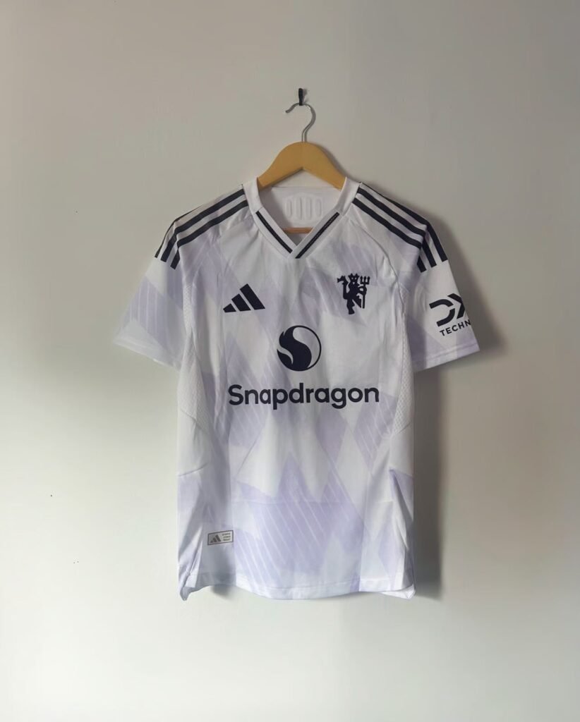
Manchester United’s away kit for the 2025/26 season aimed for a retro comeback but landed in divisive territory. The kit features a predominantly white base adorned with delicate lilac snowflake-style patterns, a nod to some of the club’s classic away designs. While some fans initially appreciated the nostalgic touch, many others were left scratching their heads at the abstract execution and faint, almost wintry motif.
The biggest criticism was directed at the pattern’s lack of clarity. From a distance, it appeared more like smudges or stains than intentional artwork. The faint lilac tones lacked contrast, making the entire shirt look washed out under stadium lights. Even the classic Adidas three-stripes across the shoulders didn’t help rescue the look, as their inconsistent styling only added to the kit’s confused identity.
For a club of Manchester United’s global stature, expectations are always high—and this away kit didn’t meet them. Fans argued that the club had missed an opportunity to blend history with modern flair in a bold, cohesive design. Instead, what they got was a subdued and forgettable look that failed to inspire excitement. For a team steeped in legacy, this kit was a rare misfire.
7. Napoli – Oceanic Wave Gone Wrong
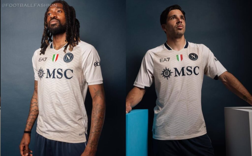
Napoli’s 2025/26 away kit took inspiration from the Mediterranean, with an abstract wave design intended to pay tribute to the club’s coastal heritage. Unfortunately, what should’ve been a visually compelling homage ended up looking like a design experiment gone off the rails. With swirls of aqua, navy, and white scattered across the shirt, the result was more chaos than coastline.
The cluttered composition made it difficult to distinguish sponsor logos or even the club crest from a distance. Fans complained it gave off strong “training bib” vibes and looked more like a surf brand than a football kit. Even the bold attempt at cultural symbolism couldn’t save the kit from widespread criticism across social media platforms.
Some fans appreciated the creativity, but most agreed it simply didn’t work on the pitch. The colors clashed in motion, and under floodlights, the disordered wave pattern became even more disorienting. Napoli’s identity, usually expressed with style and flair, was lost in a sea of overdesign. A potentially clever concept drowned by poor execution, this kit earns a disappointing spot in our countdown.
6. Valencia CF – Gradient Mishap in Orange and Maroon
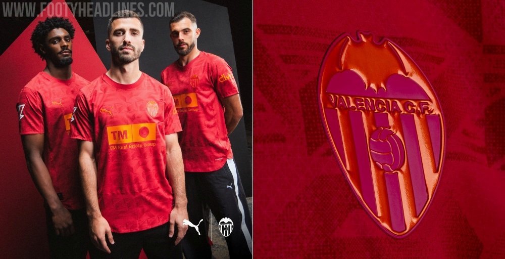
Valencia’s 2025/26 away kit tried something new with a gradient fade from bright orange to deep maroon. While the concept had potential, the execution fell flat. The colors did not blend smoothly, making the shirt look more like a dip-dye experiment than a professional football uniform. Fans quickly dubbed it the “sunset spill” kit due to its muddled and uneven transition.
What made matters worse was the abrupt cutoff at the midsection, where the two colors clashed rather than faded. This design choice made the shirt appear awkward and disjointed, with no sense of flow or visual balance. The shade of maroon used also clashed with the shorts and socks, creating a disorganized look on the pitch.
Despite the attempt at innovation, the kit failed to impress both fans and design critics. The gradient trend can work when done with precision, but this one lacked finesse. Instead of radiating energy and warmth, the jersey looked chaotic and cheap. Supporters hoped for something bolder and more refined, but instead got a fashion faux pas that stands out for all the wrong reasons. Valencia’s away kit is proof that not all risks pay off.
Also Read:
- The 10 Most Stylish Away Kits for Football 2025/26
- The 10 Most Stylish Football Home Kits of 2025
- Top 10 Worst-Looking Football Home Kits of 2025/26
- Top 10 Teams with the Most Fouls in a Single Game – 2025
5. Leeds United – Neon Yellow with Asymmetrical Stripes
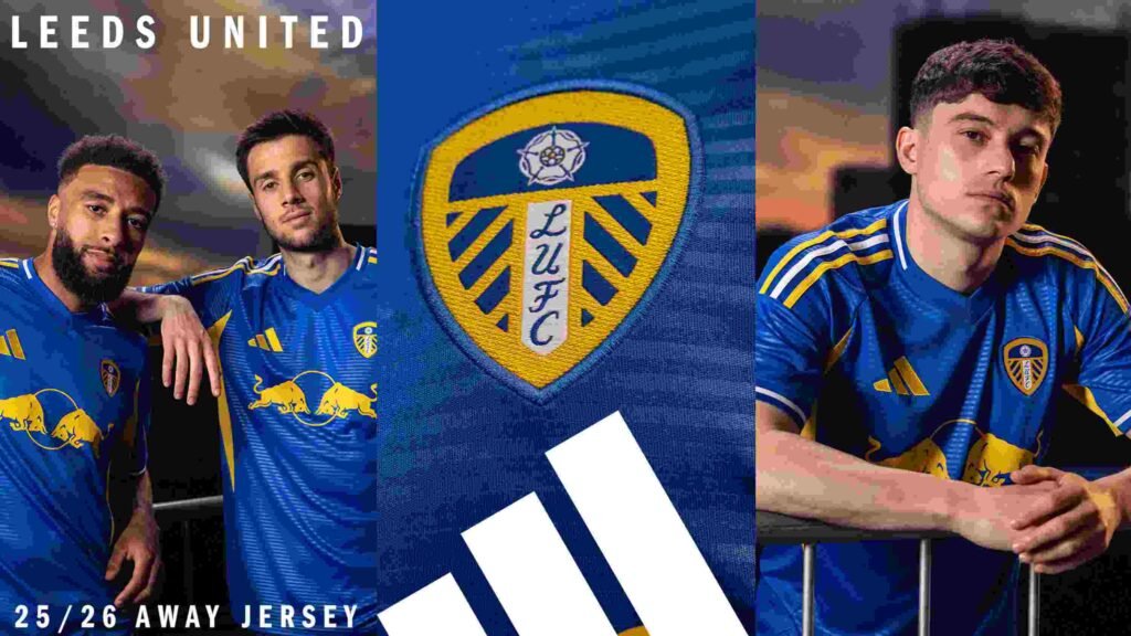
Leeds United opted for a neon yellow away kit with slanted, asymmetrical black stripes across the chest and sleeves. Unfortunately, the end result looked more like a highlighter accident than a professional football kit. While visibility was certainly not an issue, aesthetics and coherence were sorely lacking.
The jagged lines seemed randomly placed, lacking rhythm or harmony. Combined with the overly bright base, the kit gave off a disorganized and jarring appearance. Fans were quick to criticize it on social media, comparing it to “safety vests” or “construction gear.” Even the club crest and sponsor logos looked out of place against the electric background.
The design may have been intended to symbolize energy and forward movement, but it instead delivered confusion and discomfort. On the pitch, it didn’t help the team’s visual identity either, clashing with opponents’ kits in several preseason matches. Leeds is known for experimenting with bold away shirts, but this time, the gamble clearly didn’t pay off. It’s a design that might have worked as a novelty training top, but not in a competitive league setting.
4. Galatasaray – Red Meets Beige in the Worst Way
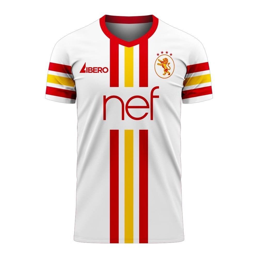
Galatasaray’s 2025/26 away kit features a baffling combination of dull beige and deep red. The kit attempted to introduce an earthy contrast to the club’s typically vibrant colors, but it ended up looking washed out and lifeless. The beige base, in particular, looked uninspired and more suitable for a vintage tea set than a football pitch.
The red detailing came in the form of jagged side panels and mismatched sleeve accents, making the entire outfit feel unbalanced. Fans criticized it as one of the dullest designs in recent memory. The shirt lacked any sharp focal points and failed to represent the passion typically associated with Galatasaray’s identity.
Instead of invoking strength and tradition, the kit came across as timid and forgettable. On social media, supporters called it “beige rage” and expressed disappointment in the club’s bold step in the wrong direction. While risk-taking is commendable, this particular attempt felt out of sync with the club’s history and image. Galatasaray’s 2025/26 away kit ended up being a missed opportunity wrapped in a muted color palette.
3. Lyon – Psychedelic Pink and Purple Puzzle
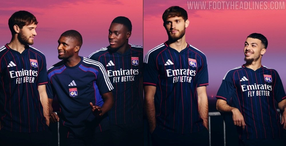
Olympique Lyonnais turned heads with a pink and purple away kit that looked more like a modern art piece than football gear. Featuring a swirling, puzzle-like design across the chest, the shirt was intended to capture creativity and youthfulness. But for many fans, it came across as garish and overwhelming.
The lack of symmetry and overuse of saturated colors gave the kit a chaotic vibe. The patterns did not flow naturally, instead appearing jumbled and unevenly distributed. Critics called it a distracting mess, and even the club’s own players seemed unsure how to pose in promo shoots.
Supporters expected something elegant and expressive, but instead got a design that resembled a children’s coloring book. The idea behind the kit may have had artistic merit, but its final form did not translate well on the field. The kit struggled to represent Lyon’s proud footballing tradition and ended up dividing opinion across fan forums.
2. Inter Milan – Chrome Grey with Rust Accents
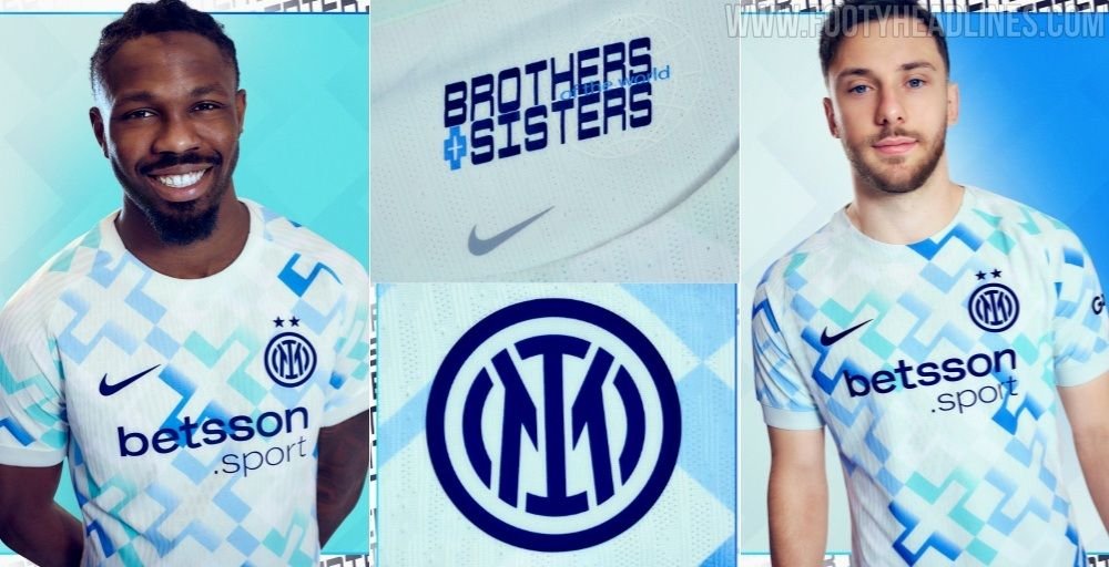
Inter Milan’s 2025/26 away kit raised eyebrows with its chrome grey base and rusty orange accents. The idea seemed futuristic at first glance, but the end result felt cold and industrial. The grey gave off a metallic sheen under stadium lights, which clashed awkwardly with the matte orange detailing on the sleeves and collar.
Supporters were quick to label it the “warehouse worker” kit, criticizing its bleak color palette and uninspiring tone. The bold attempt at modernity fell flat, and many felt it abandoned Inter’s sense of elegance and tradition. Worse still, the shirt’s material reportedly made players feel too hot during early-season games.
While innovation is often celebrated in kit design, this one went too far into dystopian territory. Inter’s attempt to reinvent the away look resulted in confusion and criticism. A bold experiment, yes—but one that will likely be remembered as a rare misstep for a club usually known for style.
1. Ajax – Inverted Flag Catastrophe
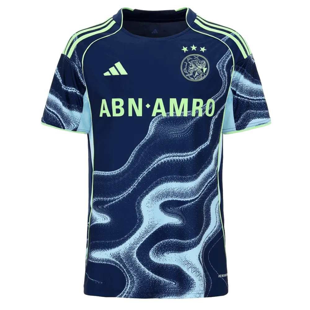
Ajax’s 2025/26 away kit took an unorthodox approach by attempting to flip the traditional Dutch flag into a jagged, sideways sash. The result was a jarring combination of deep navy, off-red, and stark white running diagonally across the front. Unfortunately, the strange angles and mismatched proportions made the kit appear chaotic and gimmicky.
Critics argued it disrespected national and club identity in pursuit of a “modern” look that felt anything but. The shirt was quickly mocked online for looking like a misplaced corporate logo rather than a football kit. Longtime Ajax fans were particularly vocal in their disappointment, with some calling it the worst away kit the club had ever worn.
Despite being manufactured by a well-known sportswear giant, the design was tone-deaf and lacked connection to the club’s legacy. Ajax typically boasts clean and elegant kits, but this version ignored that history entirely. Instead of pushing design boundaries with grace, it opted for shock value—and failed spectacularly. The kit was widely panned, cementing its place at the top of the most disappointing away kits for 2025/26.
FAQ’s:
Why are these away kits considered disappointing?
Because they either had poor color choices, awkward patterns, or strayed too far from the club’s traditional identity.
Were any of these kits made by major sports brands?
Yes, many were designed by top brands, but even big names can miss the mark when experimenting.
Do fans ever influence future kit designs?
Absolutely. Clubs often consider fan feedback, especially after heavy criticism like these kits received.
